The Psychology of Color
Why do advertisers and marketers choose certain colors? Well, it’s no secret that different colors evoke different emotions in all of us, but which colors induce which emotions?
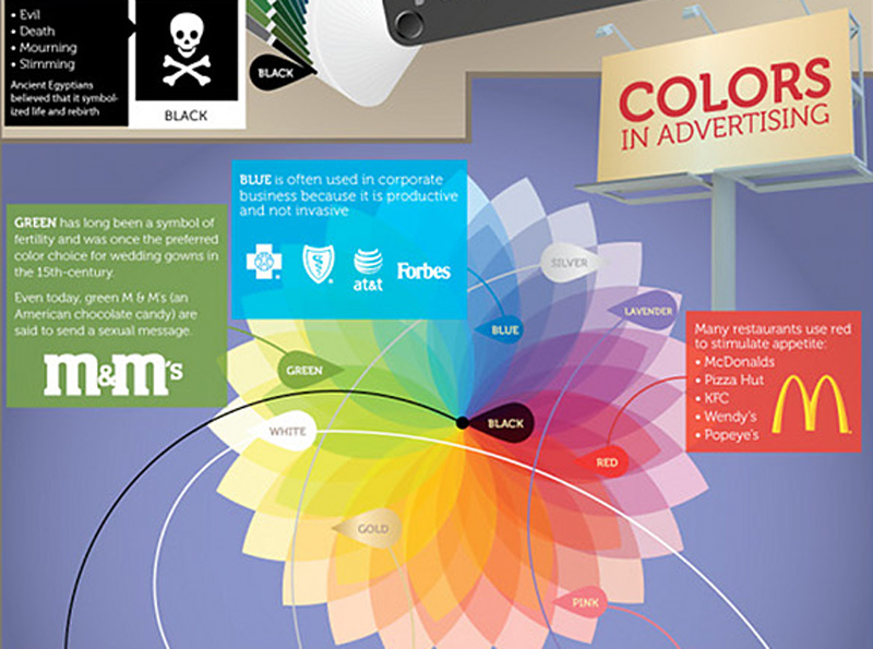
Most notably, it is suggested that red stimulates the appetite. Most food franchises like McDonald’s, Pizza Hut, Wendy’s, KFC, Chipolte, and Popeye’s use red prominently in their branding. [ Note: That’s why Visual Impact Systems uses a bright red for its corporate color—to spur your ‘appetite’ for quality advertising and marketing services from a dynamic, stimulating, and passionate company! ].
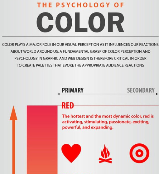
Click on the following image to see an infographic showing color palettes for web design, and what reactions they evoke from the viewer (Source: DDW):
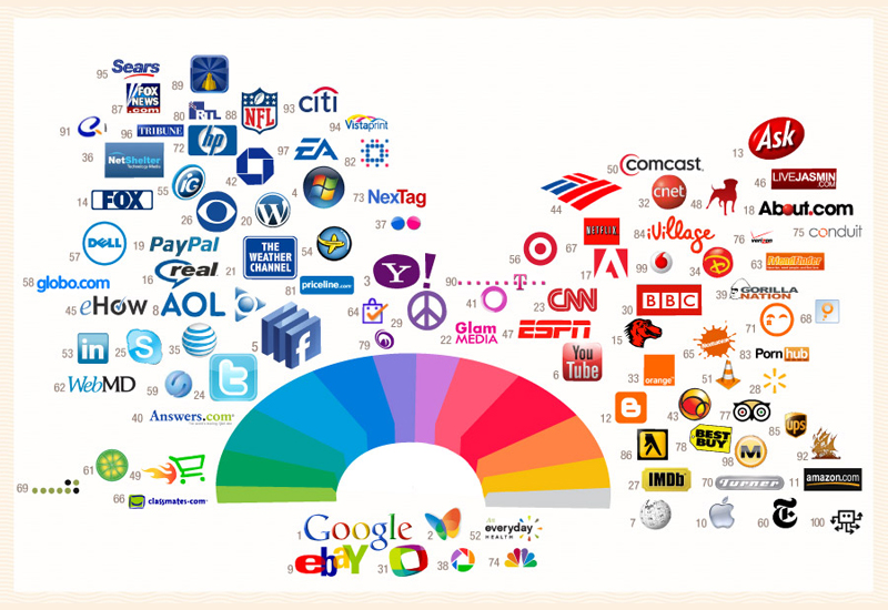
In the ‘corporate’ world, a medium to dark blue is used because it ‘communicates’ stability and productivity. Many of the larger, established worldwide companies like IBM, Ford, HP, Intel, Samsung, Boeing, Unilever, Blue Cross/Blue Shield, GAP, American Express, Panasonic, Microsoft, and LinkedIn al use blue for their logos. (Could the more ‘corporate’ focus be why Facebook’s logo is blue?). [ Click on the following image for an infographic of the logo colors of the top 100 brands on the Internet (Source: ColourLovers) ].
In the food ‘world’, red colored foods are typically associated with sweetness—such as strawberry or cherry flavors. By contrast, yellow colored foods are associated with sour flavors like lemons. Green is perceived as tart in flavor, such as apples or limes. Darker colors such as black, blue or purple can actually be perceived as negative by consumers, because those colors are associated with spoiled or rotten foods. It has also been proved that the color of a food can actually influence the taste!
The following is a more detailed list of the psychological properties of specific colors (Source: Color Affects):
Red
Psychological Association: Physical
Positive: Physical courage, strength, warmth, energy, basic survival, ‘fight or flight’, stimulation, masculinity, excitement.
Negative: Defiance, aggression, strain.
Blue
Psychological Association: Intellectual
Positive: Intelligence, communication, trust, efficiency, serenity, duty, logic, coolness, reflection, calm
Negative: Coldness, aloofness, lack of emotion, unfriendliness
Yellow
Psychological Association: Emotional
Positive: Optimism, confidence, self-esteem, extraversion, emotional strength, friendliness, creativity
Negative: Irrationality, fear, emotional fragility, depression, anxiety, suicide
Green
Psychological Association: Balance
Positive: Harmony, balance, refreshment, universal love, rest, restoration, reassurance, environmental awareness, equilibrium, peace
Negative: Boredom, stagnation, blandness, enervation
Holiday Associations: Green is also the colour of St. Patrick’s Day
Violet (Purple)
Psychological Association: Spiritual
Positive: Spiritual awareness, containment, vision, luxury, authenticity, truth, quality.
Negative: Introversion, decadence, suppression, inferiority
Orange
Positive: Physical comfort, food, warmth, security, sensuality, passion, abundance, fun
Negative: Deprivation, frustration, frivolity, immaturity
Pink
Positive: Physical tranquility, nurture, warmth, femininity, love, sexuality, survival of the species
Negative: Inhibition, emotional claustrophobia, emasculation, physical weakness
Grey
Positive: Psychological neutrality
Negative: Lack of confidence, dampness, depression, hibernation, lack of energy
Black
Positive: Sophistication, glamour, security, emotional safety, efficiency, substance
Negative: Oppression, coldness, menace, heaviness
White
Positive: Hygiene, sterility, clarity, purity, cleanness, simplicity, sophistication, efficiency
Negative: Sterility, coldness, barriers, unfriendliness, elitism
Brown
Positive: Seriousness, warmth, Nature, earthiness, reliability, support
Negative: Lack of humour, heaviness, lack of sophistication
REFERENCES:
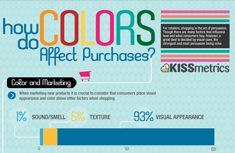
The following infographic shows how colors affect purchases (color increases brand recognition by 80%!). The chart also links a color with the ‘type’ of a consumer. Click on the image below to see entire chart (Source: KissMetrics):
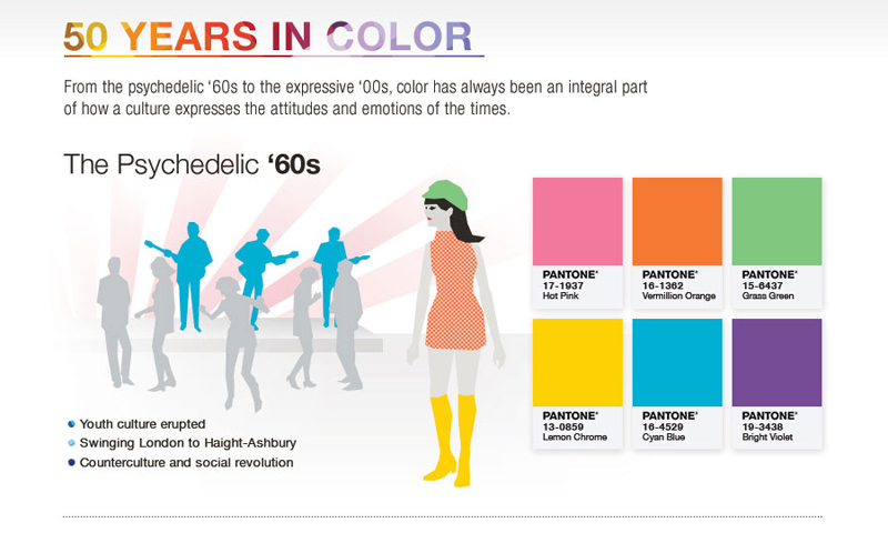
Pantone, a global authority on color—especially in the graphics arts industry—celebrated its 50th anniversary in 2013 by creating an infographic that takes a look at the history of color in the past 50 years. Click on the image below to see the entire chart (Source: Pantone):
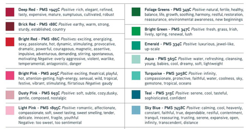
For more detail, Pantone produced the following infographic to show their popular PMS colors and their associated ‘moods’:
The following infographic shows, among other things, a color wheel that indicates the colors used by certain in advertising by certain companies. Click on the image to see the entire chart (Source: CertaPro Painters):
“Mere color, unspoiled by meaning, and unallied with definite form, can speak to the soul in a thousand different ways” [ Oscar Wilde ].
